


UX design = Kids playground for website building
First month into my internship and here's what I've done.


What's fun about being the UX designer in a web development project?
It's absolutely up to your creativity to draw a website that you enjoy browsing around. And, It's just like playing Photoshop where you do not need any coding experience. (Yes... I used to make derivative work of anything with Photoshop back in primary school, thanks to PewDiePie)
Here's how I see User Experience (UX) design.
If you followed through my last blog where I wrote about getting into this rare internship, I promised to give a more detailed walkthrough of the UX design of the company website. For what I used to create the UX design, i was suggested to use either Figma or Adobe XD. Since I've used several Adobe software before and for the sake of sounding professional, I stuck with XD. Not saying XD is better, Figma is actually very useful for real-time collaboration like Google Docs. However, I am sadly the sole UX designer in this project. UX designing is all about how we want readers to walk through our website. What/How much information do we want them to know, and how do we show them in the most comfortable and eye-catching way.
Comfortable: One scroll, got everything I need, briefly.
Eye-catching: plain yet cool. It's why people prefer IOS I guess.
👆Hey this is too cool for the 90s
Since I'm building an informative website where we merely want readers to understand what our company does, the website is, by purpose, static and precise.
Static: Website stays the same even if you come back 100 years later.
Precise: fewer words the better.
In short, the concept is pretty clear if you search for some of the major brands. When I'm doing all the researching and wireframing, just think about the SPEC.
SPEC: Static, Precise, Eye-catching, Comfortable
Wireframe is the sandbox of UX, Prototype is where it gets tricky yet fun.
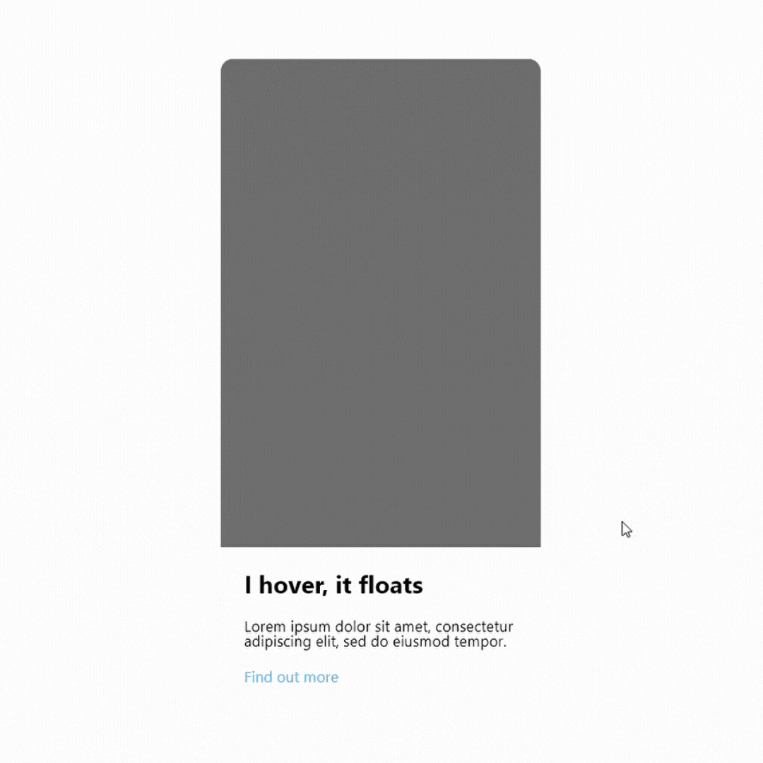
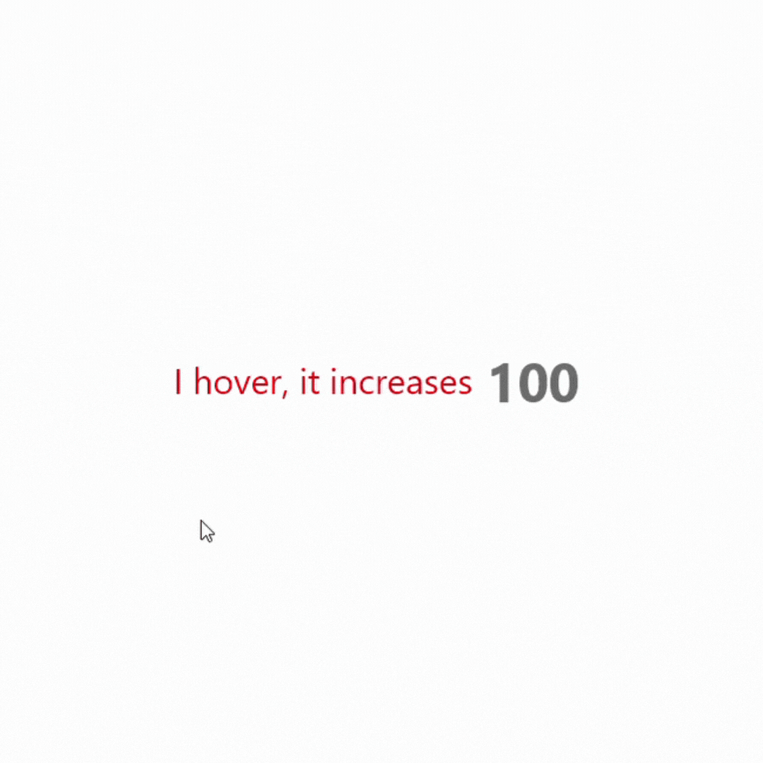
How we order the company's products, basic info, contact info, awards, and how the layout looks are what wireframing does. Prototype is adding all the details to the wireframe to mimic the final product. I tend to focus on getting the animation done, like the hover effect, slider, drop-down menu, etc.
The hardest parts out of all the animations I did were the slider gallery and a "bug-free" drop-down menu. In Adobe XD, there isn't a clear way of creating something in one artboard where the animation can be automatically looped back and forth. In order to automatically slide through the gallery, I couldn't find another way but to create separate artboards to display the auto-sliding with prototyping. It was really ugly and slid too fast but it's the only way out of 14,000,605 different outcomes. (Marvel meme..)
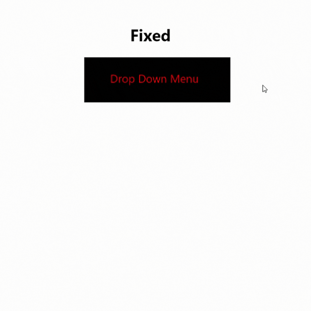
 Creating a drop-down menu isn't hard, but creating a bug-free one is. The problem with Youtube videos is that they show you how it's done, but they don't show you the potential bug that lies within. The first version I made has a tiny yet annoying bug. In the default state, the menu just "zero opacity" until it's in the hover state where it went full opacity. Everything seems fine until I tested it out, the drop-down menu appeared when the cursor wasn't yet hovered to the menu bar.
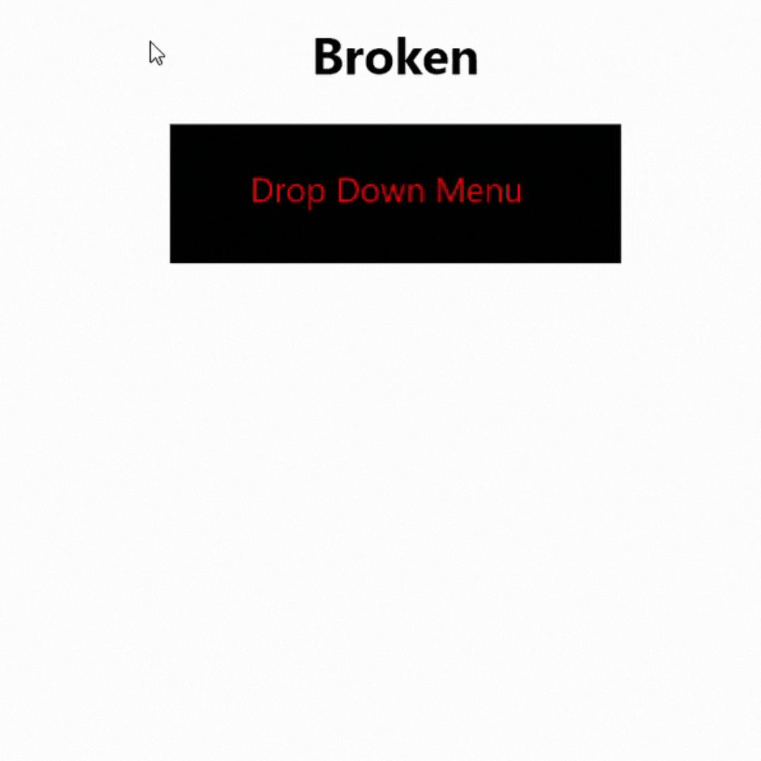
I later realized that there is a green component area where it triggers the hover state effect whenever the cursor hovers to it, and the area extends to the full drop-down menu even when it's in zero opacity. Therefore, the menu appears when I hover over the hidden menu.
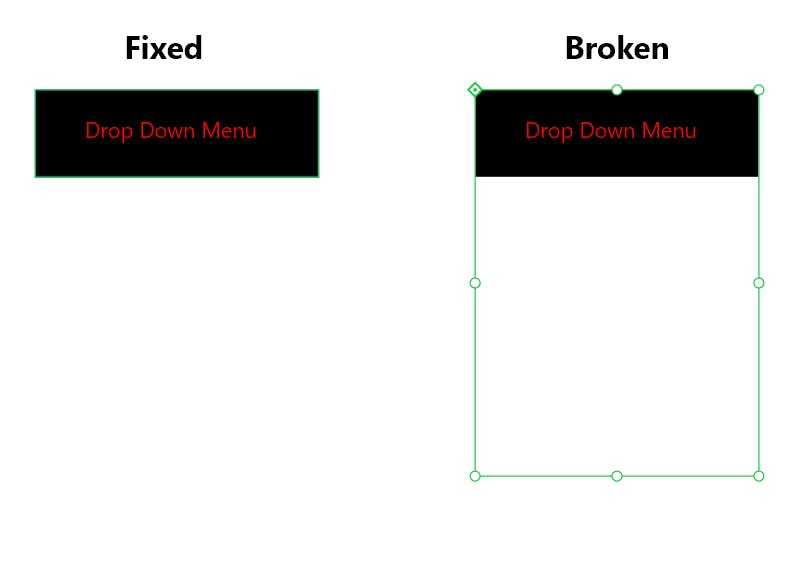
I solved it by shrinking and snuffing the entire drop-down menu into the menu bar so the green area pulls back to just the menu bar. so the hover state only triggers when my cursor hovers over the menu bar.
Mastered UX, yet I have. Much to learn, i still have
Professionals have made a living out of UX design and I'm only a month in. Although the overall design has been completed, It was far from a professional UX design. I'm sure this part of my training will continue in future projects, but now I must move on to Front-end. Stay tuned for the next blog. Comment your thought, and change my mind with your view.
BTW, One purpose of creating UX is to deliver it to Front-end so he/she can build the website from this blueprint. Luckily, I'm the UX designer AND front-end in this project so I'm just talking to myself. I am also setting all the deadlines and budget so count me as the PM as well. Wait, there is no backend for an informative website so does that make me the sole member of this project? Funny, the strongest is always the loneliest.